Pantone vs. CMYK for Tin Box Printing: Which Color Method Should You Choose?
Struggling to choose between Pantone and CMYK for your custom metal tin boxes? Learn the key differences in cost, MOQ, and print quality to make the best choice for your brand.
Quick Guide: Which Printing Method Should You Choose?
For tin box printing, CMYK and Pantone are not competing methods where one is always better. The right choice depends on your artwork, brand color requirements, and the visual effect you want on tinplate.
| Your Tin Box Design | Recommended Printing |
|---|---|
| Product photos | CMYK |
| Gradients / complex graphics | CMYK |
| One or two solid colors | Pantone |
| Brand logo with a specific color | Pantone |
| Strict brand guidelines | Pantone / CMYK + Pantone |
| Photos + important brand color | CMYK + Pantone |
| Metallic tinplate effect | Depends on artwork |
| Not sure | Send us your artwork for a recommendation |
Is Pantone More Expensive Than CMYK?
To understand how your metal tin boxes come to life, it helps to look at how these two color systems are physically applied on a printing press, and more importantly, how it impacts your cost and production timeline.
The actual cost of your custom tin box printing isn’t determined by a single color choice. Instead, it is driven by a combination of key manufacturing factors:
Number of colors
Printing process
Artwork
Tin size
Quantity
Setup
Production requirements
To help you understand how this translates in practice, here is how different design scenarios affect your budget:
Simple 1–2 color design
What it means: Minimalist logos, text-based branding, or flat vector designs.
Cost Impact: Pantone may be practical. Using 1 or 2 spot colors keeps the setup efficient and delivers crisp, solid brand hues without needing a full 4-color process run.
Full-color photographic design
What it means: Complex gradients, realistic pictures, or multi-colored artistic patterns.
Cost Impact: CMYK is usually more appropriate. Trying to recreate a photographic image using spot colors would require dozens of expensive custom inks and plates, making CMYK the only practical and cost-effective choice.
CMYK + Pantone (Hybrid Printing)
What it means: Using a standard 4-color process background paired with a dedicated spot color for a critical brand logo.
Cost Impact: Additional spot color may affect production cost. While it gives you the best of both worlds visually, remember that every extra Pantone color adds a dedicated printing plate and setup requirement, which can impact your overall production cost—especially for lower quantities.
Does CMYK or Pantone Affect MOQ?
CMYK and Pantone do not automatically have different MOQs. For custom tin box production, MOQ is generally determined by the overall manufacturing requirements rather than the color system alone.
Factors that may affect MOQ include:
- Tin box size and shape
- New tooling or existing tooling
- Printing requirements
- Number of printing colors
- CMYK, Pantone, or CMYK + Pantone
- White base or special printing effects
- Production setup
- Total order quantity
For example, a simple rectangular tin using an existing mold may have different production requirements from a custom-shaped tin requiring new tooling. Similarly, adding Pantone spot colors or special printing effects may affect the production setup and total cost, but it does not necessarily mean that the Pantone option has a fixed higher MOQ.
The best way to determine the MOQ and pricing is to evaluate the complete project—including the tin size, shape, artwork, printing requirements, and quantity—together.
Have a tin box project in mind? Send us your artwork and specifications for a customized MOQ and quotation.
Table of Contents
What Is CMYK Printing?
CMYK is a subtractive color model used in color printing. The acronym stands for the four primary ink colors used in the printing process:
C – Cyan
M – Magenta
Y – Yellow
K – Key / Black
CMYK Printing on Tinplate
CMYK printing is a versatile choice for custom tin boxes, especially when the artwork contains photographs, gradients, illustrations, or other complex visual elements. By combining cyan, magenta, yellow, and black, CMYK process printing can reproduce a wide range of colors and is well suited to full-color packaging designs.
What Is Pantone Printing?
Pantone, commonly referred to as the Pantone Matching System (PMS), is a standardized color reproduction system widely used across various industries, especially in packaging and graphic design.
Unlike the process-mixing of CMYK, the Pantone system relies on a standardized, pre-mixed palette of specific ink recipes—often called spot colors or solid colors.
Pantone Printing on Tinplate
Pantone spot color printing is often used for tin boxes when a design relies on specific solid colors, brand colors, or logos that need controlled and consistent color reproduction. Unlike CMYK process printing, which creates colors by combining four process inks, Pantone printing uses a specific spot color selected from a Pantone color system.
CMYK vs. Pantone Comparison
| Factor | CMYK | Pantone |
|---|---|---|
| Best for | Photos & gradients | Solid brand colors |
| Color system | Process color | Spot color |
| Brand color control | Good | Better for specific spot colors |
| Complex images | Excellent | Not ideal |
| Number of colors | Broad range through 4-color process | Specific spot colors |
| Typical application | Full-color artwork | Logos / solid colors |
| Tinplate effect | Depends on white base | Depends on white base |
| Best choice | Complex artwork | Brand-focused artwork |
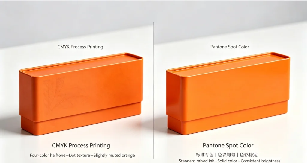
Comparison image of CMYK and Pantone tin boxes
Why Does White Base Matter in Tin Box Printing?
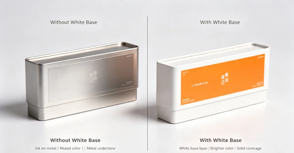
Because tinplate has a natural metallic luster, printing directly onto the bare metal can dull ink vibrancy. Applying a white base layer acts as an opaque foundation, ensuring accurate CMYK color reproduction, higher contrast, and a professional finish for your custom metal packaging.
Comparison image of Without White Base vs. With White Base
How Does Metallic Tinplate Affect Printed Colors?
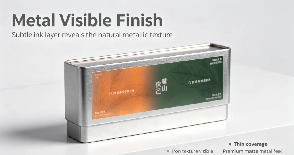
Unlike white paper, raw tinplate features a reflective, silvery-grey metallic surface. Because CMYK printing inks are semi-transparent, the bare metal interacts with the ink, often muting colors or adding an industrial sheen. Understanding this interaction is key to predicting how white layers and transparent finishes will impact your final custom tin design.
Image of Metalized effect
Not Sure Which Printing Method Is Right for Your Tin Box?
1. Does your tin box design contain product photos, realistic images, or gradients?
Yes → CMYK is usually the better choice.
CMYK printing is well suited for photographs, gradients, illustrations, and complex full-color designs. If your tin box artwork looks more like a product package with multiple colors and images, CMYK can reproduce a wide range of visual details efficiently.
Recommended: CMYK Printing
2. Does your design mainly use one or a few solid brand colors? Yes → Pantone spot color may be the better choice.
Yes → Pantone spot color may be the better choice.
If your design is relatively simple and your logo or main artwork uses specific solid colors, Pantone spot colors can provide a more controlled and consistent color target.
Recommended: Pantone Spot Color
3. Does your tin box have product photos AND a specific brand color?
Yes → Consider CMYK + Pantone.
This is a common solution for packaging that combines complex images with important brand colors. CMYK can be used for photographs and detailed graphics, while a Pantone spot color can be added for a logo or key brand color.
Recommended: CMYK + Pantone Spot Color
4. Does your brand have strict color guidelines?
Yes → Pantone or CMYK + Pantone may be appropriate.
If your packaging must follow a specific brand guideline, providing the Pantone reference for your logo or key brand colors can help establish a clear color target for production.
For designs that also contain photographs or complex graphics, CMYK + Pantone may be the better solution.
Recommended: Pantone Spot Color or CMYK + Pantone
5. Do you want the natural metallic appearance of the tinplate to show through?
Yes → Your printing method should be planned around the metallic effect.
Tinplate can be used as part of the visual design. Depending on the artwork, some areas may be printed with a white base while other areas can leave the natural metal surface visible.
This is especially useful for designs that intentionally use metallic or premium visual effects.
Recommended: Discuss the artwork with our printing team
6. Do you need your logo to match an existing brand color?
Yes → Provide your Pantone number or an approved color reference.
If your logo has an established brand color, a Pantone reference is useful because it gives the production team a standardized color target.
If you don’t have a Pantone number, you can also provide an existing tin box, printed package, or approved physical sample for evaluation.
Recommended: Pantone Spot Color / Color Matching
7. Are you using both photographs and a highly important brand color?
Yes → CMYK + Pantone is often the most suitable solution.
For example, a tea tin may have a photographic tea-leaf background while the company logo must remain close to its established brand color.
In this situation, CMYK handles the photographic artwork, while Pantone can be used for the key brand color.
Recommended: CMYK + Pantone
Can metallic Pantone colors be reproduced?
Yes, metallic colors can be reproduced on tin packaging, but the result depends on the selected ink, printing process, and metal surface. Metallic effects can also be created by taking advantage of the natural metallic appearance of tinplate. If an exact metallic effect is important, a physical proof is recommended because the final appearance may differ from a digital artwork preview.
How Do We Match Your Pantone Color?
To guarantee absolute precision and build complete transparency, every custom order follows this strict 5-step color matching workflow:
Important Note on Color Replication
Pantone does not mean the final color will automatically look identical to a digital screen.Because metal printing behaves differently than paper or computer monitors, the final printed appearance on your custom tin box can be influenced by several physical factors:
Do You Need a Physical Color Proof?
Choosing whether to invest in a physical color proof depends heavily on your brand requirements and quality tolerance. To help you decide when a physical sample is necessary—and when standard production control is sufficient—we categorize custom tin box projects into three distinct levels:
Normal packaging (General promotional tins or multi-color patterns)
Recommendation: Standard production color control.
Why: If your project relies on standard CMYK process printing without strict corporate hue matches, our internal pressroom color management is fully equipped to deliver a vibrant and high-quality result without the time and cost of a separate physical proof.
Important brand color (Logo-driven designs or standard retail items)
Recommendation: Pantone reference recommended.
Why: When specific brand shades matter, specifying a Pantone Matching System (PMS) number ensures our technicians mix the exact ink recipe required for your metal packaging.
Strict brand color / existing packaging (Exact corporate identity matching or re-orders)
Recommendation: Physical proof recommended.
Why: If your brand guidelines have zero tolerance for color deviation, or if you need to match an existing packaging sample from a previous run, a physical metal color proof allows you to inspect and approve the exact hue on actual tinplate before mass production begins.
How Are CMYK and Pantone Printed on Tinplate?
To understand how your metal tin boxes come to life, it helps to look at how these two color systems are physically applied on a printing press, and more importantly, how it impacts your cost and production timeline.
The Core Print Mechanics
CMYK: Uses four standard process inks (Cyan, Magenta, Yellow, Black) layered together to create a wide spectrum of photographic colors and gradients.
Pantone: Uses a pre-mixed, solid Spot color to deliver a flat, uniform shade.
When these are loaded onto a tinplate printing press, they rely on three key mechanical factors:
Plates: Every ink color needs its own dedicated metal printing plate.
Printing Units: The press has a limited number of color stations (units) it can pass through in a single run.
Color Sequence: The order in which inks are laid down on the raw tin sheet to prevent smudging or bad mixing.
Why Does This Affect My Cost and Production?
Understanding the press mechanics helps explain why different design choices directly alter your manufacturing budget and lead time:
How to Apply CMYK and Pantone Colors in Custom Tinplate Printing
Common Tin Box Printing Problems
Even when the artwork is correctly prepared, the final printed appearance of a tin box may sometimes differ from the digital design. This is because tinplate printing involves additional factors such as the metal substrate, white base, ink, coating, printing conditions, and color proofing.Here are some common tin box printing problems and what can cause them.
Why Does My Printed Color Look Too Dark?
A printed color may appear darker than expected because the final result is affected by the tinplate surface, ink coverage, color settings, and protective coating. Colors viewed on a backlit computer or phone screen can also appear brighter than the same colors printed on a physical surface.
For important projects, we recommend checking the print-ready artwork and confirming the color through a physical proof or approved production sample before mass production.
Why Does My Pantone Color Look Different on Tinplate?
A Pantone reference provides a standardized color target, but the final appearance can still vary when the color is printed on tinplate. The metallic substrate, white base, ink, coating, and printing conditions can all influence the perceived color.
If precise brand-color matching is important, we recommend providing the Pantone reference together with an approved physical sample whenever possible. A physical proof can also help confirm how the color will appear on the actual tinplate surface.
Why Does My White Look Yellowish?
White printing on tinplate can sometimes appear different from the white shown on a digital screen. The metallic substrate underneath the ink, ink coverage, and coating can affect the final appearance of white.
If a clean, solid white background is required, a white base or white ink layer may be used to separate the printed colors from the metal surface. The appropriate approach depends on the artwork and the areas where you want the natural metallic finish to remain visible.
Why Doesn't My Metallic Effect Look Like the Artwork?
A metallic effect shown in digital artwork does not always reproduce exactly the same way on a physical tin box. The final appearance depends on whether the design uses the natural metallic surface of the tinplate, metallic ink, a white base, or a combination of printing techniques.
If your design requires a metallic or premium visual effect, it is important to specify which areas should remain metallic and which areas should be covered with white or colored ink. A physical sample is recommended when the metallic appearance is a key part of the packaging design.
Why Does My Logo Color Look Different From the Digital Proof?
A digital proof displayed on a monitor is not a direct representation of the final printed color. Different screens use different brightness, color profiles, and display settings, while the actual tin box is affected by the tinplate substrate, ink, white base, coating, and printing process.
For brand-critical logos, we recommend specifying the Pantone color reference whenever available. If you need to match an existing package or printed product, providing a physical reference sample can help the production team establish a more reliable color target.
How Can I Avoid Color Problems Before Mass Production?
The best way to reduce unexpected color differences is to review the artwork and printing requirements before production begins.
We recommend:
- Providing the correct CMYK or Pantone color references
- Clearly indicating areas that require a white base
- Identifying areas where the natural metallic tinplate should remain visible
- Providing an existing physical sample when color matching is required
- Requesting a physical proof or production sample for critical colors
- Confirming the final artwork and color requirements before mass production
Because every tin box design is different, the most suitable printing solution should be determined based on the artwork, tinplate surface, color requirements, and desired visual effect rather than the digital artwork alone.
Have a color or printing concern with your tin box artwork? Send us your design and requirements, and our team can review the potential printing issues before production.
Conclusion
Choosing between CMYK and Pantone printing for your custom metal tin boxes doesn’t have to be complicated. The right choice depends on your design complexity, brand identity requirements, and production budget:
Go with CMYK if your packaging features full-color photographs, complex gradients, or multi-colored artwork where cost-efficiency for a 4-color process is your main priority.
Go with Pantone if your brand requires absolute color consistency, vibrant solid fills, or exact matching for corporate logos across all production batches.
Combine Both (CMYK + Pantone) if you want the best of both worlds—using CMYK for stunning background images and a dedicated Pantone spot color to make your brand logo pop.